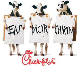
 I think that Chick-fil-A's brand is most memorable because of it's use of the cows. The use of cows intends to set the Chick-fil-A product a part from the dozens of other burger joints (McDonald's, Burger King, Wendy's, etc). The company uses the cows in sandwich boards in most if not all of their ad campaigns. The brand is seen in playful yet unique way because the cows encourage consumers to "eat mor chikin" instead of beef.
 Tuesday, November 16, 2010
Well-Branded: Chick-fil-A
 I think that Chick-fil-A's brand is most memorable because of it's use of the cows. The use of cows intends to set the Chick-fil-A product a part from the dozens of other burger joints (McDonald's, Burger King, Wendy's, etc). The company uses the cows in sandwich boards in most if not all of their ad campaigns. The brand is seen in playful yet unique way because the cows encourage consumers to "eat mor chikin" instead of beef.
 Friday, November 12, 2010
Good Logo: PBDS 501
Well I maybe a little partial because I absolutely LOVE Starbucks but I really like their logo. It is really simple and even though it doesn't give you a feeling about coffee, it is very identifiable. It isn't too busy but it is visually appealing. The colors work well together. The logo is an advertisement in itself because when people walk around with the Starbucks cup, other recognize it right away.
Tuesday, November 9, 2010
Go Loco for Logos!
Everyone can identify with this logo. Nickelodeon used the slime as a logo and it became a brand within the station. Even though its just an orange splat, it definitely appeals to its kid audience.
The Golden Arches. The McDonald's brand is defined by that golden M. I think that color also works in this logo. If the M wasn't golden, I'm not sure that it would still have the same effect. As simple as this logo is, it is recognizable around the world.
These logos don't really work for me...
Though this logo is very recognizable, it is kind of bland to me. It doesn't really scream a television station to me. Fortunately for ABC, the brand isn't dependent on the logo.
This logo doesn't work for me because I think that it doesn't go with the company. Maybe I'm missing the concept but every time I see these commercials, I never get the logo and why there is an orange lion.
Monday, November 1, 2010
Color: The Good with the Bad
This is an example of good use of color. I like how the photo is black and white other than the sweat dripping on his face. I think that this concept from Gatorade is creative and their use of color enhances the product.
Ads/coupons like this always make me upset. This ads use of color always seems so cheap and corny looking to me. The colors don't makes sense together. I guess they were trying to catch the audiences attention but they got my attention for a totally different reason.
Ads/coupons like this always make me upset. This ads use of color always seems so cheap and corny looking to me. The colors don't makes sense together. I guess they were trying to catch the audiences attention but they got my attention for a totally different reason.
Subscribe to:
Posts (Atom)


